Redesigning my site: version 3
After a months-long redesign with some stops and starts, I’m psyched to finally share my new site with you!
I’m a sucker for behind the scenes posts. I love reading them. I love writing them. I was particularly inspired by the Redesigning Piccalilli series. So I thought it would be interesting to go over my goals for the design, the design process, and key moments in the build.
Goals for the design
Before jumping into Figma, I wrote down some goals for the redesign.
- The main purpose of this site is a blog. Posts should be easy to read and discover, with a touch of personal curation (recommended or featured posts).
- I want a site that’s personal and friendly yet clean and minimal - but not so minimal that it’s boring.
- Big type (for my old man eyes), splashes of colour maybe something green.
- Newsletter CTA. I’d love to have more people find my newsletter.
- A design I can build in a reasonable amount of time, and extensible in the future.
Overall, I’m happy with the result of the redesign. Achieving the second goal is the hardest challenge. Creating something personal and friendly while also being minimal seems like a contradiction. I’m already thinking of changes to the design to bring more personality to it in the future.
Design Phase
During the design phase, I had three design iterations. The first iteration I finished at the end of 2024. The last I finished sometime last month.
In the first iteration, I wanted to display more information so that you could understand who I was at a glance. As well as introduce some sort of post curation. I was tired of the plain old homepage, so I added more colours and photos. I was also really into gradients last year.
The second iteration went a completely different direction. I switched to warmer colours, opting for something more minimal. I also switched out the heading font to Poppins on the homepage. I really love how round and friendly it feels.
Unfortunately, both the first and second iterations were difficult to build. And when I stopped to think about it, neither design checked all my goals.
Which brings us to the final iteration!
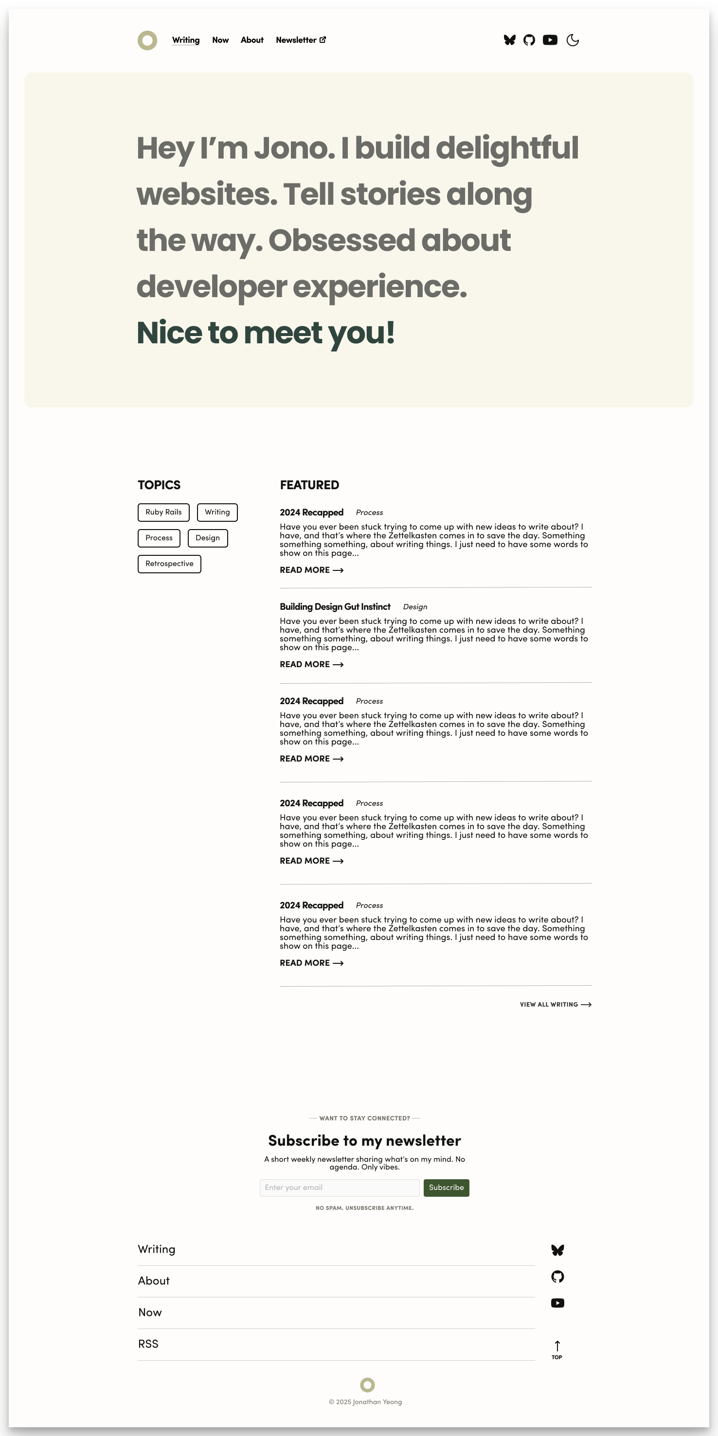
I changed out the hero because it just didn’t work when the screen was super wide. Instead, I took inspiration from the original introduction paragraph and turned it into a hero. I also made the About section an actual page. I’d like to extend that page in the future.
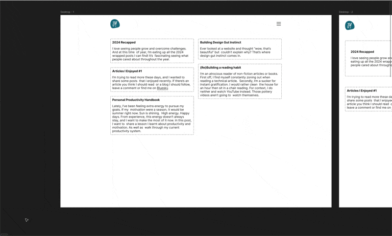
One thing I love about Figma is how easy it is to preserve your iteration process. Here’s what it looked like designing from a blank page to the second and final iteration. It’s not the most efficient design process but it looks neat!
Build Phase
During the build phase, I deviated a little from my design. Thankfully, I don’t need to be perfect during design because I’m the one building it.
Before I highlight some key changes in this build, I need to undo my past decisions:
- I removed Tailwind and rolled my own CSS. No shade against Tailwind, but I want to learn CSS, not Tailwind.
- I reintroduced my blog posts hierarchy with
/writing. I thought it looked cool to have a flat hierarchy, but it felt awkward with file based routing. - I retired my logo that I’ve had for years. I felt like it clashed with the new design. Although, it still lives on as a favicon.
Light Dark Theme
It’s been a while since I’ve written CSS. And there’s been so many cool things since I’ve last touched it. The CSS light-dark function is one of those things.
In my stylesheet, I set the :root pseudoclass to use the light dark color scheme along with some light-dark variables:
:root {
	color-scheme: light dark;
	--color-text: light-dark(var(--color-dark-text), var(--color-light-text));
	--color-bg: light-dark(var(--color-light-bg), var(--color-dark-bg));
}
To implement the theme switcher, I first check if there’s a theme in local storage. If there’s not, then I get the browser theme. I toggle the theme, and set color-scheme to the new theme, as well as update the local storage.
const preferredColorScheme = (() => {
	return window.matchMedia('(prefers-color-scheme: dark)').matches ? 'dark' : 'light';
});

const handleToggleClick = () => {
	const currentTheme = localStorage.getItem('theme') || preferredColorScheme()
    const newTheme = currentTheme === 'dark' ? 'light' : 'dark'
    document.documentElement.style.setProperty('color-scheme', newTheme)
    localStorage.setItem('theme', newTheme);
}
I also wanted to make sure my code blocks switch between dark and light mode. Under the hood, Astro uses Shiki to parse markdown code blocks. And it has hooks to modify the Shiki config:
// In astro.config.js
shikiConfig: {
  themes: {
	dark: 'everforest-dark',
	light: 'everforest-light',
  },
  defaultColor: false
},
It’s important to set defaultColor to false. This forces Shiki to generate a token with both light and dark variables. Example from Shiki docs:
<span style="--shiki-dark:#D8DEE9;--shiki-light:#2E3440">console</span>Then in my CSS, I use light-dark function to switch between the two variables:
.astro-code,
.astro-code span {
  color: light-dark(var(--shiki-light), var(--shiki-dark));
  background-color: light-dark(var(--shiki-light-bg), var(--shiki-dark-bg));
}
This way a user can manually toggle the theme, or set their browser appearance and the code blocks will change colours correctly.
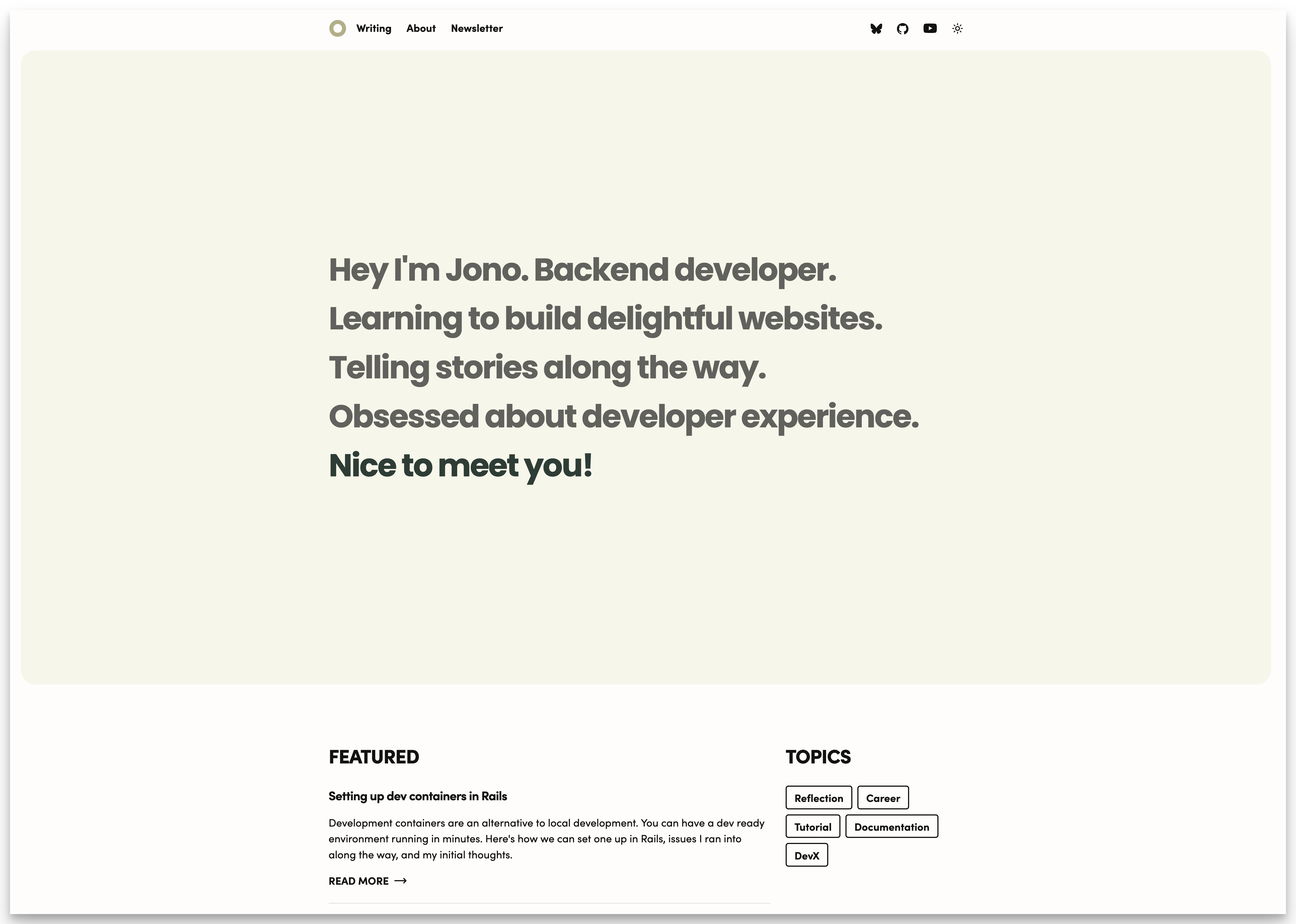
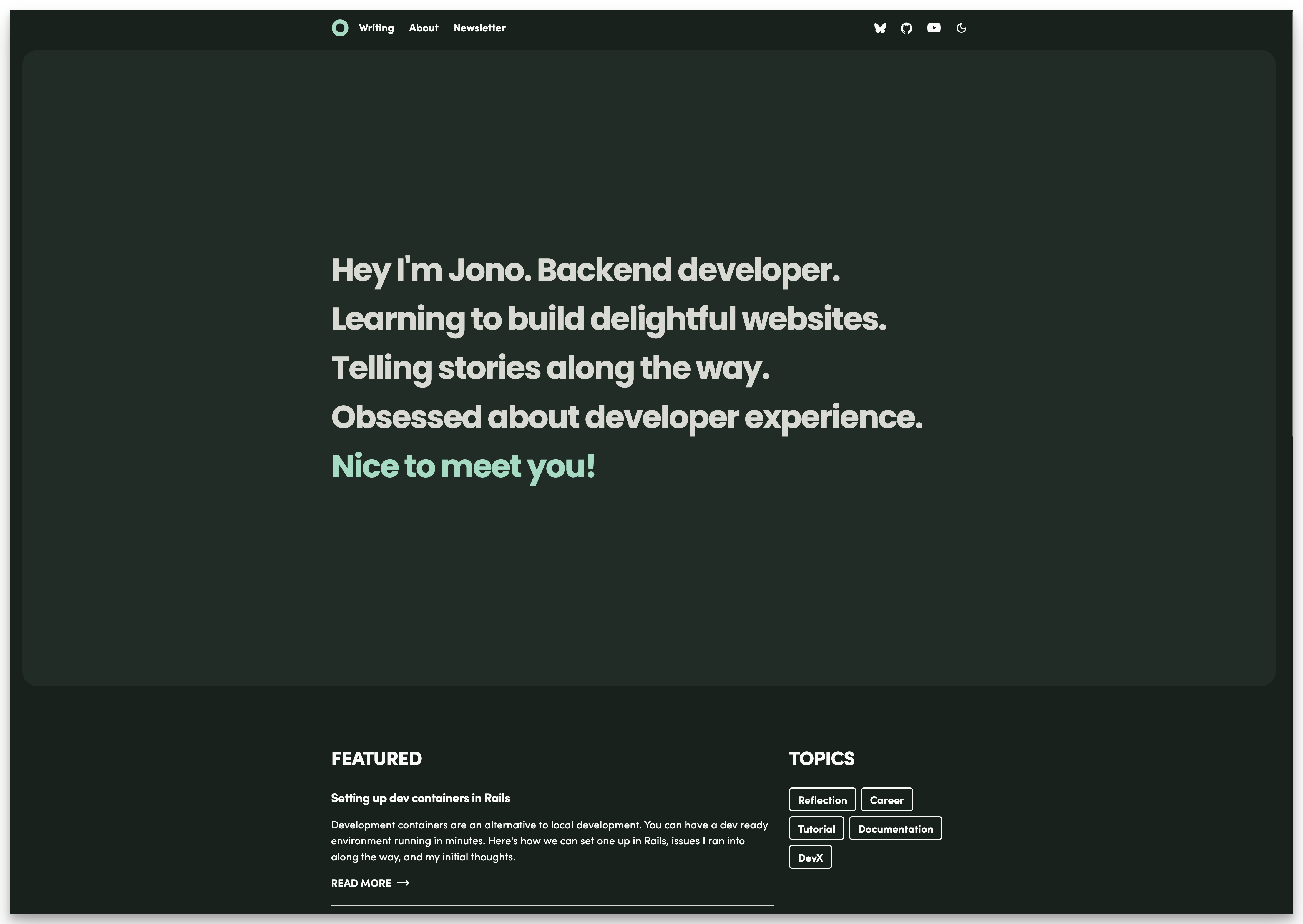
Animating the Hero text
I wanted to try my hand at animating some text using only CSS. It’s a small experiment to get myself more comfortable with animations.
First, let’s start with the HTML:
<p>
    <span class="animate-phrase">Hey I'm Jono.</span>
    <span class="animate-phrase">Backend developer.</span>
    <span class="animate-phrase">Learning to build delightful websites.</span>
    <span class="animate-phrase">Telling stories along the way.</span>
    <span class="animate-phrase">Obsessed about developer experience.</span>
</p>
I wanted to have each span slide up on load, staggered from each other. To achieve this animation, my CSS follows these steps:
- Setup the initial state of the text.
- Define a key frame that transitions from the initial to final state.
- For each
animate-phrase, add an animation with a slight delay to stagger each phrase.
By setting the animation-fill-mode to forwards my animate-phrase class will retain the properties of the last keyframe.
@media (prefers-reduced-motion: no-preference) {
    .animate-phrase {
	  display: inline-block;
      opacity: 0;
      transform: translateY(50px);
    }

    @keyframes slideUp {
      0% {
        opacity: 0;
        transform: translateY(50px);
      }
      100% {
        opacity: 1;
        transform: translateY(0);
      }
    }

    .animate-phrase:nth-child(1) {
      animation: slideUp 500ms ease-out 0ms 1 forwards;
    }
    .animate-phrase:nth-child(2) {
      animation: slideUp 500ms ease-out 100ms 1 forwards;
    }
    .animate-phrase:nth-child(3) {
      animation: slideUp 500ms ease-out 200ms 1 forwards;
    }
    .animate-phrase:nth-child(4) {
      animation: slideUp 500ms ease-out 300ms 1 forwards;
    }
    .animate-phrase:nth-child(5) {
      animation: slideUp 500ms ease-out 400ms 1 forwards;
    }
}
Writing out the CSS transition wasn’t too bad. But I can see why you would switch to using a JS library.
It’s a pain to manage the delay for the stagger. If I were using a JS animation library like anime.js, it could look like this:
import { createTimeline, stagger } from 'animejs';

document.addEventListener('DOMContentLoaded', () => {
	const timeline = createTimeline();
	timeline
	  .add('.animate-phrase', {
		opacity: [0, 1],
		translateY: [50, 0],
		duration: 500,
		delay: stagger(100)
	  })
});
Subscribing users to my newsletter
Finally, I got to write some backend code 🤩.
Beehiiv has an API you can use to subscribe emails to your newsletter. I needed to create a server side endpoint in Astro to call this API.
First step is to create a pages/api/subscribe.ts file that calls the Beehiiv endpoint.
For brevity, I omitted validations and error checking in the following code blocks.
import type { APIRoute } from 'astro'

export const prerender = false

export const POST: APIRoute = async ({ request }) => {
	const formData = await request.formData();
	const email = formData.get("email");
	const beehiivUrl = `https://api.beehiiv.com/v2/publications/${import.meta.env.BEEHIIV_PUBLICATION_ID}/subscriptions`

	const response = await fetch(beehiivUrl, {
		method: "POST",
		headers: {
		  "Content-Type": "application/json",
		  "Authorization": `Bearer ${import.meta.env.BEEHIIV_API_KEY}`
		},
		body: JSON.stringify({ email }),
	});

	return new Response(
		JSON.stringify({
			message: "Success! Check your email to confirm!"
		}),
		{ status: 200 }
	);
}
Adding export const prerender = false tells Astro that this file should be server side rendered.
Next in my Newsletter.astro component, I set up the client side code to call this backend endpoint.
const formElement = document.getElementById('newsletterForm') as HTMLFormElement;

formElement.onsubmit = async (e) => {
	e.preventDefault();

	try {
		const formData = new FormData(formElement);
		const email = formData.get("email")
		const response = await fetch("/api/subscribe", {
			method: "POST",
			body: formData,
		});

		const result = await response.json();
        formElement.reset();
    } catch (error) {
      console.error('Error:', error);
    }
};
The last thing was to add the corresponding adapter to my Astro config. I’m using Netlify so I added adapter: netlify().
Huge props to Astro for making hybrid rendering relatively easy! I love that I can statically render my Newsletter.astro component but have it call a server side rendered route.
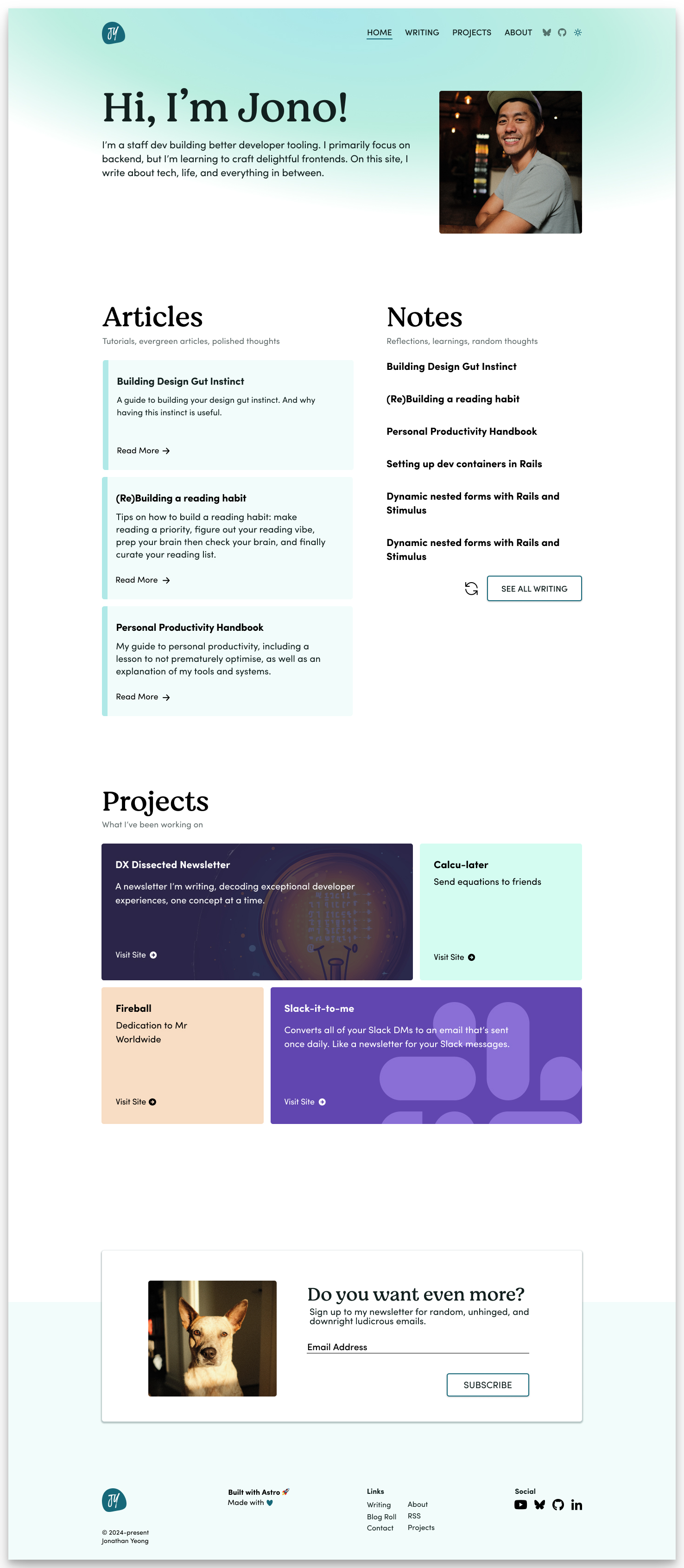
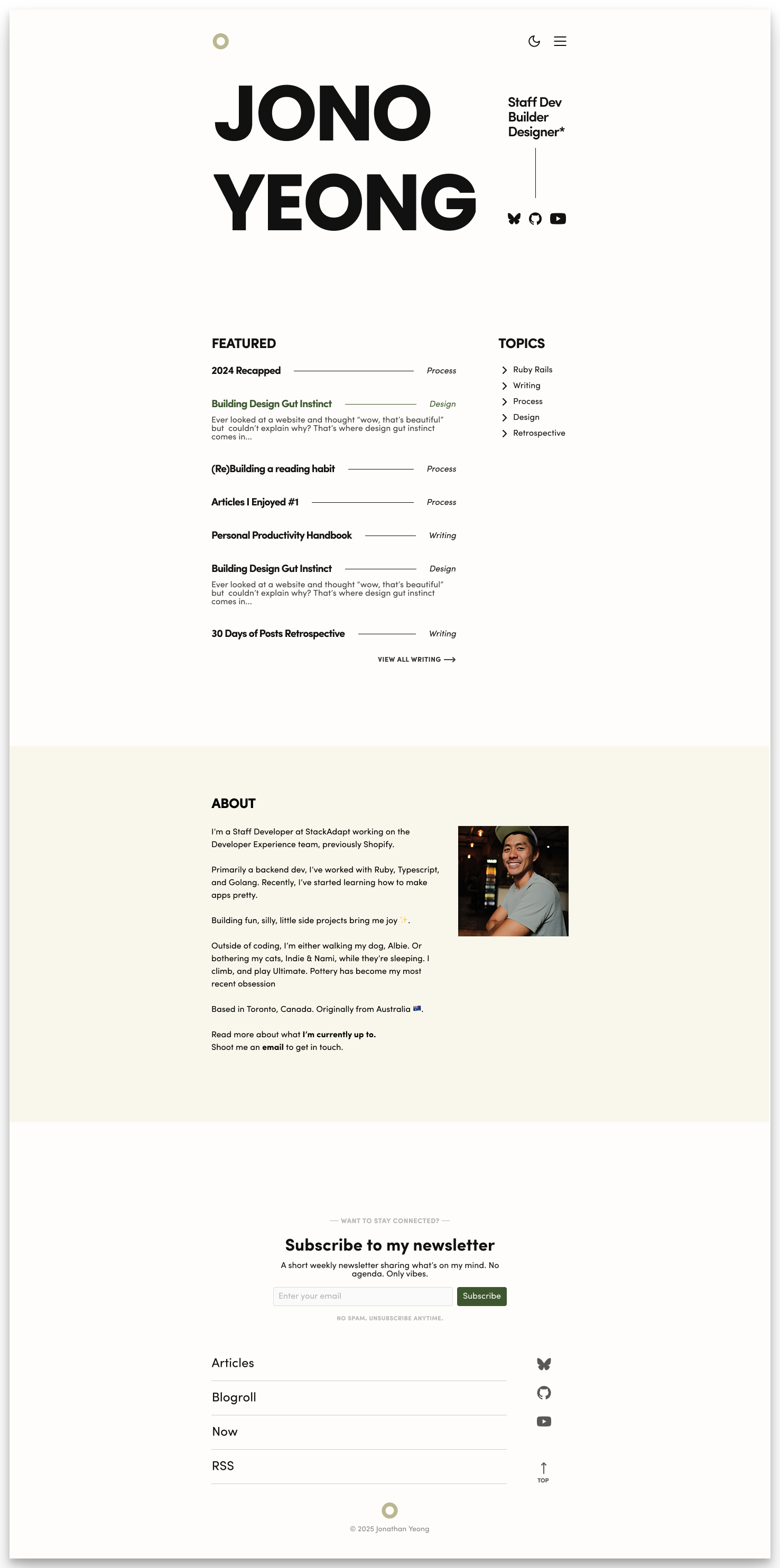
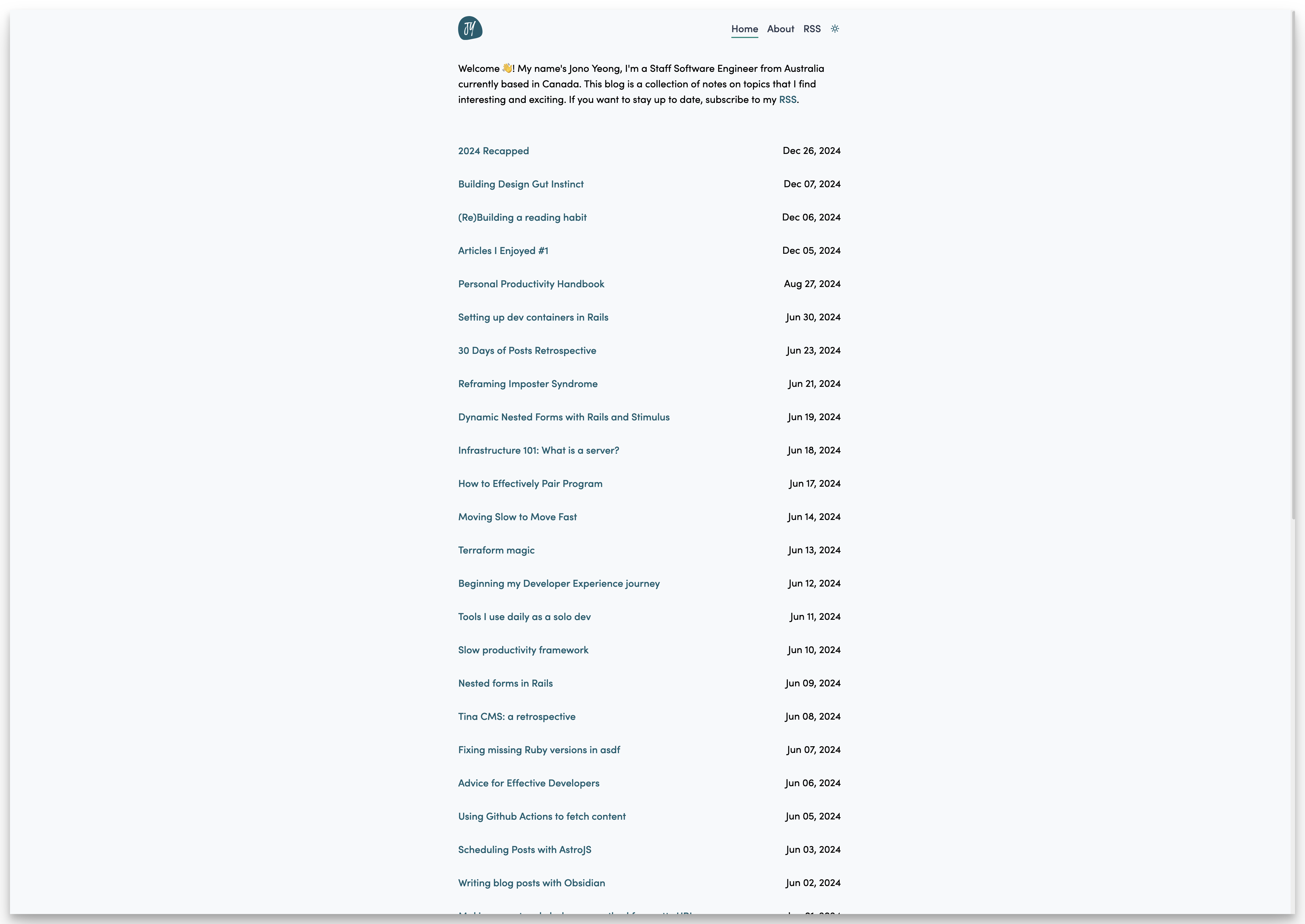
Before and after of the homepage
To wrap everything up, here are some before and after pictures of the homepage. It’s nice to see the difference at a glance!
Before
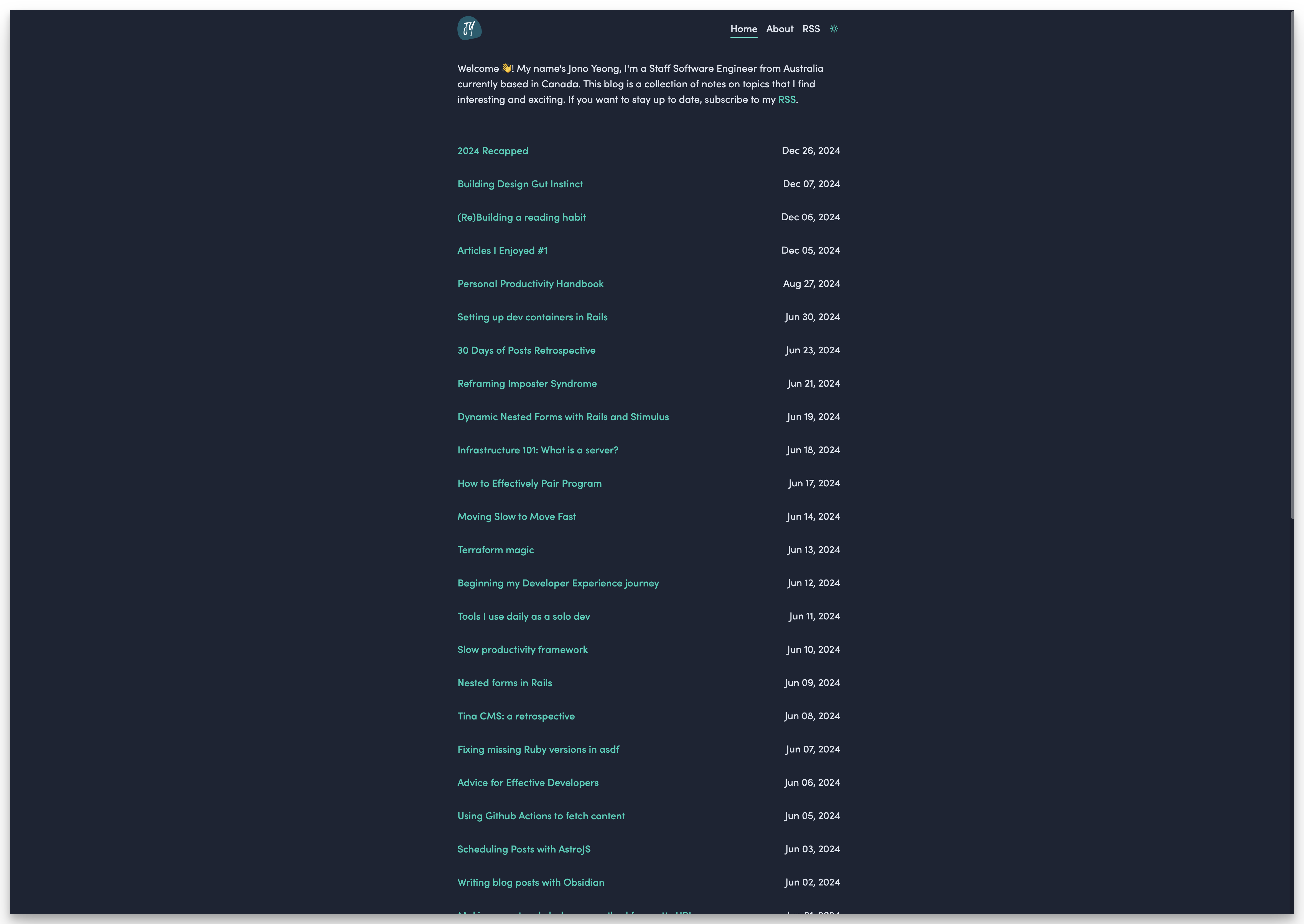
After
Conclusion
I learnt so much throughout this redesign. It’s given me an appreciation of both design and frontend. That shit is hard! I already have a laundry list of things I want to add and tweak. But for now, the major part is done.
I hope you like the new design! Let me know what you think. Shoot me an email or DM me on Bluesky!